Getting Started With the Web Interface
21
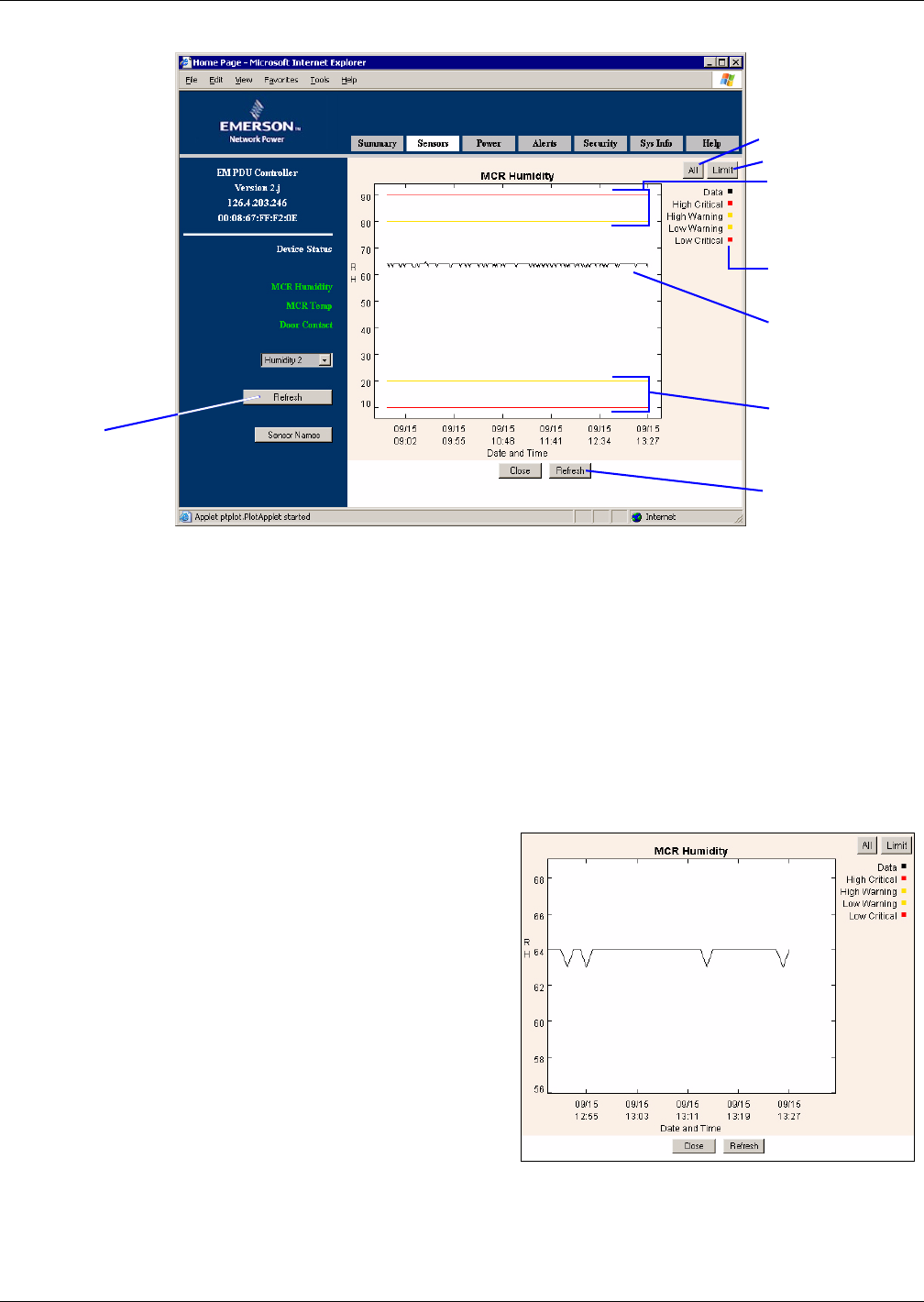
Figure 6 Sensor graph - humidity sensor example
The line graph shows the selected sensor’s readings (black) chronologically from left to right—the
most current reading is on the far right—as well as Warning (yellow) and Critical (red) limits.
•Use the All or Limit button to change the scale of the y-axis on the graph, as follows:
•Click Limit to use the High and Low Critical values to determine the upper and lower bound-
aries of the graph. In the example above, the y-axis extends from 10% to 90%, which are the
Low Critical and High Critical values for Humidity Sensor 2.
•Click All to include the sensor data readings to determine the upper and lower limits of the
graph. In the example above, if a data reading were 95%, the y-axis scale would extend from
10% to 95% to include that reading. (If all sensor data readings fall within the High and Low
Critical limits, the All and Limit buttons display the same scale extending from the Low Crit-
ical value to the High Critical value.)
• Use click-and-drag to zoom in or out:
• To zoom in on an area of the graph, click
and drag the mouse downward to draw a
box around the area. The maximum zoom
level shows 10 units on the y-axis (degrees
or percentage points, for example) and six
data samples on the x-axis.
• To zoom out, click and drag the mouse in an
upward direction. (Or click on All or Limit
to restore the graph to full view.)
•Click the Refresh button to update the graph
with the most recent sensor reading. The sensor
is sampled at regular intervals. See 5.7.3 - Data
Presentation to change this interval.
•Click the Close button to exit the Sensor
Graphs window and return to the Sensor Data
window.
SENSOR GRAPH
Humidity sensor
example
Graph of
sensor data
Refresh
button
Graph of
lower limits
Graph of
upper limits
Legend
All button
Limit button
Refresh button
ZOOM IN FEATURE - Humidity sensor example